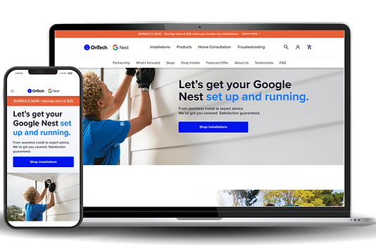
OnTech & Google Nest
E-commerce website redesign for catalog and professional installations of Google Nest products.
Overview
SUMMARY
ROLE
Lead Designer | Sr Product Designer
TIMELINE
1 month
TOOLS USED
-
Figma
-
Adobe Photoshop
-
Quantum Metric
-
JIRA
OKR #1
1.3x
ORDERS SHIFT
OKR #2
4.2x
CONVERSION INCREASE
CHALLENGES
BUSINESS CHALLENGES
❌ Decrease in sales
❌ Low customer retention
❌ Dependence on agent-placed orders
USER CHALLENGES
❌ Lack of brand awareness & trust
❌ Outdated website design
❌ Insufficient reasons to purchase installations
SOLUTIONS
🎨 Page redesign
RESULTS
✅ Surpassed all OKRs within 1 week of launch
🏆 Executive endorsement: The project received strong praise from senior leadership
⭐️ Great user experience: Received 95% QXScore on UserTesting
🚀 Brand impact: Improved online presence via accurate brand design representation


The Team
STAKEHOLDERS
Sr. Leadership
Business Leads
LEAD & OPERATIONS
Product Manager
Program Manager
Mid-Level Managers
Daniela Paz Arévalo
Lead UX/UI Designer
Tech Lead 1
Tech Lead 2
RESEARCH, DESIGN & DEVELOPMENT
UX/UI Researcher
UX/UI Designer
Developer
QA Engineer
SEO Specialist
01
Discovery
THE PROJECT
DISH (now EchoStar) had hired an agency to work on the redesign for 6 months prior and were unhappy with the results.
I was asked to step in to lead and restart the redesign, with less than a month of time left.
Considering the tight timeline and previously wasted efforts, I wanted to make sure the design decisions were all backed by reliable data -- our actual users.


THIS INCLUDED:
🔎 Working closely with the UX Research team:
-
Closely collaborated on what tests were needed: page layout, imagery testing, user satisfactio
📈 Reviewing real-time user behavior data
-
Using Quantum Metric for heatmaps, click rates, attention levels to understand UX and behavior
OKR #1
WEB ORDERS
52%
60%
48%
40%
AGENT-PLACED ORDERS
OKR #2
CONVERSION RATE
6.9%
8%
01.01 BEFORE
We started off by discussing the requirements with the team to ensure we were all clear on the expectations.
With this, examining the then-current state of the website.


01.02 DESIGN RESEARCH
The other designer and I examined relevant designs with a focus on:

Luxury brands:
➡️ OnTech’s rebrand: “white glove” experience
➡️ See how luxury brands are presenting themselves
➡️ Online experiences users are familiar with
Clean & Modern design:
➡️ OnTech’s rebrand; minimalist & breathable approach
➡️ Current-day, impactful experiences
Home brands:
➡️ Relevant industry
➡️ Home furniture, decor
01.03 DESIGN METRICS

To best understand user frustrations, I gathered data from the live site using Quantum Metric.
This research consisted of measuring interactions, click and tap rates, attention rates, and heatmaps within the prior 30 days.
RESULTS REVEALED:
1
Design was not intuitive
2
3
Despite lowest attention levels at the bottom of the page, it had more clicks than other sections.
Users clicked in each section, even with no CTA
Attention dropped halfway through products
Prioritize showing relevant products of interest
Lack of clarity, users were not finding what they needed
Notably, CTAs that provide users with further information & clarity:
-
“Contact Us”
-
“Installation Appointments”
-
“FAQ”


01.04 UX RESEARCH
We met with the UX Researcher to go over research needs.

PAGE COMPREHENSION TIMEOUT TEST

Timeout test | Page Comprehension
-
Overall positive sentiment about the site
-
Users wanted to know more about OnTech before making a purchase
-
Users were confused if the page was selling products and installations or just installations
Test
(Test size: 50 users)
Insight
Action
-
Test page hierarchy to better organize page
-
Include more information about OnTech so users understand the company and the process
IMAGERY FIRST IMPRESSION TEST


Test
First Impression test Product Images
(Test size: 50 users)
Insight
-
Users were unsure of what they were getting on the site: products, products and installations or just installations?
-
Users resonated most with the installation images
Action
-
Use installation images for just installations
-
Use lifestyle for product & installation
-
Use product image for just products
HIERARCHY CLICK & RANK TEST

Test
Hierarchy test | Click & Rank
(Test size: 50 users)
Insight
-
Users didn’t really understand what OnTech was when coming from a different site
-
They needed more information/context to feel comfortable making a purchase
Action
-
Move sections as needed -- “What’s Included” to the top of the page to provide more information
-
Reviews linked at bottom of the page for viewing
CTA PREFERENCE TEST

.png)
.png)
Test
Preference test CTA Buttons
(Test 1 size: 50 users)
(Test 2 size: 15 users)
Insight
Users preferred:
-
Primary button: lighter blue button
-
Secondary button: blue outlined turning to light blue
Action
-
Primary CTA: Light blue filled
-
Secondary CTA: Light Blue Ghosted to Light Blue Filled
-
Tertiary CTA: Dark Blue to Light Blue Underlined
CART PREFERENCE TEST

Test
Preference test | View Cart
(Test size: 50 users)
Insight
-
Users wanted information on their cart, either price or number of items in cart
-
Users preferred “View Cart” in upper right corner
Action
-
Include price of cart
-
Put cart in top-right instead of bottom-middle of page
02
Define
02.01 DESIGN DIRECTION
With the research and findings in place, we had a design direction in place:
Elevate OnTech's brand awareness & brand trust
-
Placed a greater emphasis on customer testimonials
-
Designed a section that introduced OnTech to the customer
Added a filtering option for products
Ensured there were CTAs in every section so the customer could find more information
Adjusted the page hierarchy to better fit the user's areas of importance
Implemented a jump navigation to help users get to their desired section faster, and to inform users on what the page contained
3.
5.
6.
4.
Enhance the page flow & layout
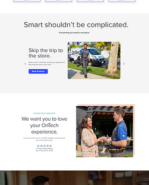
ELEVATING BRAND AWARENESS & USER TRUST
1. Placed greater emphasis on user testimonials:

2. Added sections that introduced OnTech to the customer:


ENHANCE THE PAGE FLOW & LAYOUT
3. Added a filtering option for a more convenient & relevant shopping experience.
Icons enable quicker scanning:


4. Page hierarchy - ensured the page layout and flow were based on users' preferences:
➡️ What’s included -- what users found most important
➡️ FAQ ranked lowest in what users found most important
➡️ Several clicks on price-related questions


Most important
Least important


5. Added jump navigation:
03
Design
03.01 DESIGN WORKSHOP
We had a design workshop with the team on FigJam to gather input on designs in progress to continue improving them.


03.02 DESIGN ITERATIONS
Between designers, we tackled different sections to work on, checked in regularly, and co-designed other sections as needed to balance the tight timeline & a seamless design.
V1

V2

V3

03.03 BEFORE & AFTER
Between designers, we tackled different sections to work on, checked in regularly, and co-designed other sections as needed to balance the tight timeline & a seamless design.
Before

After

03.03 FINAL DESIGNS
I created High-fidelity screens from the previous screens. I added gradients for creating a sense of playfulness yet calm, colors were chosen with psychological effects in mind, in accordance to the topic.


04
Prototype
04.01 PROTOTYPES
MOBILE
Mobile Prototype
Mobile prototype scrolling through the page redesign.
DESKTOP
Desktop Prototype
Desktop prototype scrolling through the page redesign:
05
Handoff
05.01 DEV HANDOFF
During the development process we ran into dev tool limitations.
Besides meetings with clear communication to go in-depth with expected site behavior and designs, I provided detailed annotations including:
➡️ Measurements of all elements and spacing
➡️ Typography, color, and interaction details
➡️ The destination to all links
➡️ Google Sheet with a to-do list of updates that had been missed


06
Impact
06.01 OKR RESULTS
After just 1 week from launch, the results showed a consistent surpassing of all OKRs:
OKR #1 | INCREASE WEB ORDERS
GOAL OKR
WEB ORDERS
52%
60%
48%
40%
AGENT-PLACED ORDERS
IMPACT
WEB ORDERS
63%
37%
AGENT-PLACED ORDERS
EXCEEDED BY
1.3x
OKR #2 | CONVERSION RATE
GOAL OKR
6.9%
8%
IMPACT
11.5%
EXCEEDED BY
4.2x
QXSCORE
95%
Great user experience (91% - 100% range)
Official
-
Usability
-
Task Success
-
Customer satisfaction
-
Reliability and trust
-
Appearance
-
Net promoter score
measurement focusing on:
06.02 UPDATED METRICS
➡️ Decrease in click rates at the bottom of the page for "Contact Us", "Installation Appointments" & "FAQ"
This reflected the success of the redesign:
➡️ Users found what they were looking for on the page
➡️ It was what they needed to complete their purchases


06.03 REFLECTION
PRIORITIZATION
The tight timeline pushed the team to prioritize what was needed for the designs.
Organized files, strategizing, and most importantly, strong collaboration, were essential in creating reliable designs and the success of the project.
INTENTIONAL DESIGN
Proper research was pivotal for the foundation, execution, and validation of the designs.
Advocating for collaboration and integration with the UX Research team made all the difference in achieving the results for our users to convert.
ADAPTABILITY
Shifting business needs and development limitations were prevalent through the project.
Balancing business and user requirements, timeline considerations, taking initiative, clear communication, and efficient problem-solving were necessary for the success of the project.


